Typography #
Font Family
Aa
Fira Sans Condensed
| h1 |
The Spectacle Before Us |
|
|---|---|---|
| h2 |
The Spectacle Before Us Was |
|
| h3 |
The Spectacle Before Us Was Indeed |
|
| h4 |
The Spectacle Before Us Was Indeed Sublime. |
|
| h5 |
The Spectacle Before Us Was Indeed Sublime. |
|
| h6 |
The Spectacle Before Us Was Indeed Sublime. |
|
Links on a Dark Background
Consequat occaecat ullamco amet non eiusmod nostrud dolore irure incididunt est duis anim sunt officia. Fugiat velit proident aliquip nisi incididunt nostrud exercitation proident est nisi. Irure magna elit commodo anim ex veniam culpa eiusmod id nostrud sit cupidatat in veniam ad. Eiusmod consequat eu adipisicing minim anim aliquip cupidatat culpa excepteur quis. Occaecat sit eu exercitation irure Lorem incididunt nostrud.
Header and Subheader, Inline Links
The Spectacle Before Us Was
The Spectacle Before Us Was Indeed Sublime
Consequat occaecat ullamco amet non eiusmod nostrud dolore irure incididunt est duis anim sunt officia. Fugiat velit proident aliquip nisi incididunt nostrud exercitation proident est nisi. Irure magna elit commodo anim ex veniam culpa eiusmod id nostrud sit cupidatat in veniam ad. Eiusmod consequat eu adipisicing minim anim aliquip cupidatat culpa excepteur quis. Occaecat sit eu exercitation irure Lorem incididunt nostrud.
Breadcrumbs
Blockquotes #
Option 1
Pellentesque habitant morbi tristique senectus et netus et malesuada fames ac turpis egestas. Vestibulum tortor quam, feugiat vitae, ultricies eget, tempor sit amet, ante. Donec eu libero sit amet quam egestas semper. Aenean ultricies mi vitae est. Mauris placerat eleifend leo.
    <div class="container-fluid">
      <div class="row">
        <div class="col-md-12">
          <blockquote class="quote-default">
            <p class="lead">
              Pellentesque habitant morbi tristique...
            </p>
            <footer class="blockquote-footer">
              Quoted Source in <cite title="Source Title">Source Title</cite>
            </footer>
          </blockquote>
        </div>
      </div>
    </div>
Option 2
Quoted Source - Source Title
Pellentesque habitant morbi tristique senectus et netus et malesuada fames ac turpis egestas. Vestibulum tortor quam, feugiat vitae, ultricies eget, tempor sit amet, ante. Donec eu libero sit amet quam egestas semper. Aenean ultricies mi vitae est. Mauris placerat eleifend leo.
  <div class="container-fluid">
    <div class="row">
      <div class="col-md-12">
        <blockquote class="quote-2">
          <h5><span class="font-weight-bold text-uppercase">Quoted Source </span> <cite title="Source Title"> - Source Title</cite></h5>
          <p class="lead">
            Pellentesque habitant morbi...
          </p>
        </blockquote>
      </div>
    </div>
  </div>
Option 3
Pellentesque habitant morbi tristique senectus et netus et malesuada fames ac turpis egestas. Vestibulum tortor quam, feugiat vitae, ultricies eget, tempor sit amet, ante. Donec eu libero sit amet quam egestas semper. Aenean ultricies mi vitae est. Mauris placerat eleifend leo.
  <div class="container-fluid">
    <div class="row">
      <div class="col-md-12">
        <blockquote class="quote-3">
          <p class="lead">
            Pellentesque habitant morbi...
          </p>
          <footer>
            Quoted Source in <cite title="Source Title">Source</cite>
          </footer>
        </blockquote>
      </div>
    </div>
  </div>
Using the small tag to display disclaimer text #
Pellentesque habitant morbi tristique senectus et netus et malesuada fames ac turpis egestas. Vestibulum tortor quam, feugiat vitae, ultricies eget, tempor sit amet, ante. Donec eu libero sit amet quam egestas semper. Aenean ultricies mi vitae est. Mauris placerat eleifend leo. Pellentesque habitant morbi tristique senectus et netus et malesuada fames ac turpis egestas. Vestibulum tortor quam, feugiat vitae, ultricies eget, tempor sit amet, ante. Donec eu libero sit amet quam egestas semper. Aenean ultricies mi vitae est. Mauris placerat eleifend leo. Pellentesque habitant morbi tristique senectus et netus et malesuada fames ac turpis egestas. Vestibulum tortor quam, feugiat vitae, ultricies eget, tempor sit amet, ante. Donec eu libero sit amet quam egestas semper. Aenean ultricies mi vitae est. Mauris placerat eleifend leo.
  <small>
    Pellentesque habitant morbi tristique senectus et netus et malesuada fames ac turpis egestas. Vestibulum tortor quam...
  </small>
Callout Paragraphs #
Option 1
Default Callout Header
Pellentesque habitant morbi tristique senectus et netus et malesuada fames ac turpis egestas. Vestibulum tortor quam, feugiat vitae, ultricies eget, tempor sit amet, ante. Donec eu libero sit amet quam egestas semper. Pellentesque habitant morbi tristique senectus et netus et malesuada fames ac turpis egestas. Vestibulum tortor quam, feugiat vitae, ultricies eget, tempor sit amet, ante. Donec eu libero sit amet quam egestas semper.
  <div class="container-fluid">
    <div class="row">
      <div class="col-md-12 callout-default-header"></div>
      <div class="col-md-12 callout-default py-4">
        <div class="container w-75 m-auto">
          <div class="row bg_white my-5 pb-4 justify-content-center">
            <div class="col-md-10 pt-5 ">
              <h3 class="no-border">Default Callout Header</h3>
              <hr class="yellow-border" />
              <p>
                Pellentesque habitant morbi...
              </p>
            </div>
          </div>
        </div>
      </div>
    </div>
  </div>
Option 2
Callout Header Option 2
Pellentesque habitant morbi tristique senectus et netus et malesuada fames ac turpis egestas. Vestibulum tortor quam, feugiat vitae, ultricies eget, tempor sit amet, ante. Donec eu libero sit amet quam egestas semper. Pellentesque habitant morbi tristique senectus et netus et malesuada fames ac turpis egestas. Vestibulum tortor quam, feugiat vitae, ultricies eget, tempor sit amet, ante. Donec eu libero sit amet quam egestas semper. Pellentesque habitant morbi tristique senectus et netus et malesuada fames ac turpis egestas. Vestibulum tortor quam, feugiat vitae, ultricies eget, tempor sit amet, ante. Donec eu libero sit amet quam egestas semper. Pellentesque habitant morbi tristique senectus et netus et malesuada fames ac turpis egestas. Vestibulum tortor quam, feugiat vitae, ultricies eget, tempor sit amet, ante. Donec eu libero sit amet quam egestas semper.
  <div class="container-fluid">
    <div class="row">
      <div class="col-md-12 callout-2 justify-content-center">
        <h3 class="no-border">Callout Header Option 2</h3>
        <hr class="dotted-border" />
        <p>
          Pellentesque habitant morbi...
        </p>
      </div>
    </div>
  </div>
Option 3
Callout Option 3 With Featured Image
Pellentesque habitant morbi tristique senectus et netus et malesuada fames ac turpis egestas. Vestibulum tortor quam, feugiat vitae, ultricies eget, tempor sit amet, ante. Donec eu libero sit amet quam egestas semper.
  <div class="container-fluid">
    <div class="row mb-4 box-shadow callout-3">
      <!-- left side text -->
      <div class="col-md-8 p-0 d-flex flex-wrap align-items-center">
        <div class="p-3">
          <h3 class="mb-3">Callout Option 3 With Featured Image</h3>
          <p>
            Pellentesque habitant morbi tristique...
          </p>
        </div>
      </div>
      <!-- right side image -->
        <div class="col-md-4 p-0 d-none d-md-block callout-3-image"></div>
    </div>
  </div>
Lists #
Indented, Unstyled
- Pellentesque
- morbi tristique senectus et netus
-
Lorem
- Ipsum
- Dolor
- Sit amet
- Pellentesque
- morbi tristique senectus et netus
  <ul class="list-no-bullet-points">
    <li>Pellentesque</li>
    <li>morbi tristique senectus et netus</li>
    <li> Lorem
      <ul>
        <li>Ipsum</li>
        <li>Dolor</li>
        <li>Sit amet</li>
      </ul>
    </li>
    <li>Pellentesque</li>
    <li>morbi tristique senectus et netus</li>
  </ul>
Unstyled
- Pellentesque
- morbi tristique senectus et netus
-
Lorem
- Ipsum
- Dolor
- Sit amet
- Pellentesque
- morbi tristique senectus et netus
  <ul class="list-unstyled">
    <li>Pellentesque</li>
    <li>morbi tristique senectus et netus</li>
    <li> Lorem
      <ul>
        <li>Ipsum</li>
        <li>Dolor</li>
        <li>Sit amet</li>
      </ul>
    </li>
    <li>Pellentesque</li>
    <li>morbi tristique senectus et netus</li>
  </ul>
Square Styled
- Pellentesque
- morbi tristique senectus et netus
-
Lorem
- Ipsum
- Dolor
- Sit amet
- Pellentesque
- morbi tristique senectus et netus
  <ul class="list-square">
  <li>Pellentesque</li>
  <li>morbi tristique senectus et netus</li>
  <li> Lorem
    <ul>
      <li>Ipsum</li>
      <li>Dolor</li>
      <li>Sit amet</li>
    </ul> </li>
    <li>Pellentesque</li>
    <li>morbi tristique senectus et netus</li>
  </ul>
Triangle Styled
- Pellentesque
- morbi tristique senectus et netus
-
Lorem
- Ipsum
- Dolor
- Sit amet
- Pellentesque
- morbi tristique senectus et netus
  <ul class="list-triangle">
    <li>Pellentesque</li>
    <li>morbi tristique senectus et netus</li>
    <li>
      Lorem
        <ul>
          <li>Ipsum</li>
          <li>Dolor</li>
          <li>Sit amet</li>
        </ul>
    </li>
    <li>Pellentesque</li>
    <li>morbi tristique senectus et netus</li>
  </ul>
Standard Ordered List
- Pellentesque
- morbi tristique senectus et netus
-
Lorem
- Ipsum
- Dolor
- Sit amet
- Pellentesque
- morbi tristique senectus et netus
  <ol>
    <li>Pellentesque</li>
    <li>morbi tristique senectus et netus</li>
    <li>
      Lorem
      <ol class="lower-alpha">
        <li>Ipsum</li>
        <li>Dolor</li>
        <li>Sit amet</li>
      </ol>
    </li>
    <li>Pellentesque</li>
    <li>morbi tristique senectus et netus</li>
  </ol>
Slider Images #
This element can be placed on any page using the shortcode generated by RoyalSlider, which can be accessed under RoyalSliders from the Wordpress Dashboard. It can be customized with new slides and images by navigating to the Wordpress Dashboard and selecting RoyalSlider > Edit Sliders. The HTML blocks below illustrate how these and other slider elements can be customized by selecting the "edit slide" option on each slide and then selecting the "HTML content" tab. For more information, please see the Documentation Page. The layouts include HTML blocks with the class names .left-cta, .bottom-cta, and .floating-cta respectively. Their corresponding HTML snippets can be found below, and are arranged by order of appearance in the slider element.


Verify or Apply for Financial Aid
Use 2022 Tax Return for Fall Semester.
STC Federal School Code: 030665


Scholarship Applications - Due July 25
For more information, call (912) 538-3147
Equal Opportunity Institution

TEAS Testing Dates
Vidalia: July 30
Swainsboro: July 29


Free CDL Learners Permit PREP Session
August 3 – Vidalia Commerical Truck Driving Training Center, 8AM–1PM
Learners Permit Exam is NOT part of this session.
1400 Harris Industrial Boulevard, Vidalia, GA
Left CTA HTML Structure
<div class="rsContent left-cta">
  <div class="container-fluid">
    <div class="row">
      <div class="col-md-4">
        <h3 class="display-4 white font-weight-light">Lorem ipsum dolor sit amet</h3>
        <hr class="border-white" />
        <p class="lead white">
          Eum ea cibo quaerendum, accusata dissentiet ad vis, ex eos diam dicta honestatis.
        </p>
        <a href="#" class="btn btn-secondary-yellow rounded-0 my-3 px-3" aria-label="#">
          Learn More
        </a>
      </div>
    </div>
  </div>
</div>
Bottom CTA HTML Structure
<div class="rsContent bottom-cta">
  <div class="container-fluid">
    <div class="row">
      <div class="col-md-9 m-auto text-right">
        <h3 class="display-4 white no-border">Lorem ipsum dolor sit amet</h3>
        <p class="lead white">
          Ad sit illud euripidis suscipiantur. No diam adhuc duo, an sea meis augue persequeris.
        </p>
        <a href="#" class="btn btn-info rounded-0 my-3 px-3" aria-label="#">
          Enroll Today!
        </a>
      </div>
    </div>
  </div>
</div>
Floating CTA HTML Structure
<div class="rsContent secondary-floating-cta">
  <div class="container-fluid">
    <div class="row">
      <div class="col-md-6">
        <h3 class="display-4 font-weight-bold white">LOREM IPSUM DOLOR</h3>
        <p class="lead white">
          Consulatu contentiones mea ex, deseruisse honestatis temporibus eum ex.
        </p>
      </div>
    </div>
  </div>
</div>
Testimonial Section Slider
This slider utilizes the existing Floating CTA styles found in the Homepage Slider, but the centered CTA has a slightly different structure.
[RoyalSlider Error] Incorrect RoyalSlider ID or problem with query.
Center-aligned CTA HTML Structure
<div class="rsContent floating-cta-center bg_lightyellow">
  <div class="container-fluid">
    <div class="row justify-content-center align-items-center">
      <div class="col-md-6 box-shadow">
        <h4 class="display-4 curlyquote white no-border">
          Southeastern taught me the skills I need to have a rewarding and successful career.
        </h4>
      </div>
    </div>
  </div>
</div>
Header Images #
Jumbotron
<div class="container-fluid">
  <div class="row">
    <div class="col-12 p-0">
    <div class="jumbotron rounded-0 p-0 img-jumbotron">
      <div class="jumbotron-overlay p-5">
        <div class="row ml-0 ml-md-4">
          <div class="col-xs-12 col-md-8 col-lg-5 col-xl-7">
            <h2>Jumbotron Option One with Text and Gradient Background</h2>
            <p class="lead">
            This is a simple jumbotron-style hero unit for calling extra attention to featured content or information.
            </p>
            <hr class="my-4">
            <p>
            It uses utility classes for typography and spacing to organize content out within the larger container.
            </p>
          </div>
        </div>
      </div>
    </div>
    </div>
  </div>
</div>
Add the following to the Custom Styles/Scripts section of the page's back end where this element is placed and place the path to your image between the quotation marks in url("") (be sure to include the
            < style>
              < /style>
tags).
<style>
.img-jumbotron {
background-image: url("/wp-content/uploads/2019/05/GradCap-1024x685.jpg");
}
</style>
Hero Image
<div class="container-fluid">
  <div class="row">
    <div class="col-12 p-0">
      <div class="jumbotron rounded-0 hero-img"></div>
    </div>
  </div>
</div>
Add the following to the Custom Styles/Scripts section of the page's back end where this element is placed and place the path to your image between the quotation marks in url(""). Be sure to include the relative path, not the absolute path, i.e. /wp-content/uploads/img.jpg instead of /wp-content/uploads/img.jpg
  <style>
    .hero-img {
      background-image: url("");
    }
  </style>
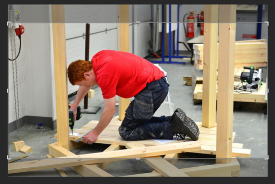
Captions and Images #
Left-aligned caption
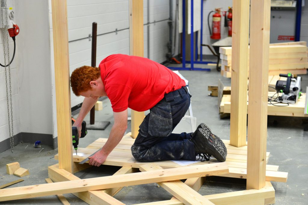
  <figure class="figure">
    <img src="/wp-content/uploads/2019/05/Construction-1024x681.jpg" class="figure-img img-fluid align-self-center" alt="placeholder image for caption snippet" />
    <figcaption class="figure-caption">
      A left-aligned caption.
    </figcaption>
  </figure>
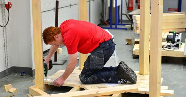
Right-aligned caption
  <figure class="figure">
    <img src="/wp-content/uploads/2019/05/Construction-1024x681.jpg" class="figure-img img-fluid align-self-center" alt="placeholder image for caption snippet" />
    <figcaption class="figure-caption text-right">
      A right-aligned caption.
    </figcaption>
  </figure>
Center-aligned caption
  <figure class="figure">
    <img src="/wp-content/uploads/2019/05/Construction-1024x681.jpg" class="figure-img img-fluid align-self-center" alt="placeholder image for caption snippet" />
    <figcaption class="figure-caption text-center">
      A center-aligned caption.
    </figcaption>
  </figure>
Border Radius #
.rounded
.rounded-top
.rounded-right
.rounded-bottom
.rounded-left
.rounded-circle
.rounded-0
Round Image

<img src="/wp-content/uploads/2019/07/round.png" class="rounded-circle" alt="circular Bootstrap utility" />
Square Image

<img src="/wp-content/uploads/2019/07/square.png" class="rounded-0" alt="square Bootstrap utility" />
Accordions #
Note on using ids: Each separate id needs to be unique to its respective instance on the page. For example, if one accordion or tab group is of id "audrey01" no other ids in the code can be named the same, though numbers may be appended on subsequent ids (i.e. "audrey02").
For example, say you want two Header Only Accordions on your page. Copy the below snippet and add it to your backend, replacing the following names in the second snippet with unique names:
-
"accordion",#accordion -
"collapseOne",#collapseOne -
"headingOne" -
"collapseTwo",#collapseTwo -
"headingTwo" -
"collapseThree",#collapseThree -
"headingThree"
It's important to switch out all instances to avoid conflicts and unpredictable behavior in your accordion element. For more information on id naming conventions, see this article.
It's also important to note that when pasting code snippets that contain HTML comments into the text tab on a WYSIWYG editor, the comments will be rendered between opening and closing "p" tags automatically placed by WordPress. To fix this, simply delete the comments and resave your page.


Header Only Accordion
  <div class="container-fluid">
    <div class="row">
      <div class="col-md-6">
        <h3 class="font-weight-bold text-uppercase">Header Only <span class="font-weight-normal">Accordion</span></h3>
        <div id="accordion" class="accordion">
          <div class="card">
            <div class="card-header d-flex align-items-center rounded-0 p-2" id="headingOne" data-toggle="collapse" data-target="#collapseOne" aria-expanded="false" aria-controls="collapseOne">
              <strong>
                Collapsible Group #1
              </strong>
              <i class="fas fa-plus-square ml-auto"></i>
            </div>
            <div id="collapseOne" class="collapse" aria-labelledby="headingOne" data-parent="#accordion">
              <div class="card-body">
                Lorem ipsum dolor sit amet, duo no quidam constituto...
              </div><!-- card-body -->
            </div><!-- collapse -->
          </div><!-- card -->
          <div class="card">
            <div class="card-header d-flex align-items-center rounded-0 p-2" id="headingTwo" data-toggle="collapse" data-target="#collapseTwo" aria-expanded="false" aria-controls="collapseTwo">
            <strong>
              Collapsible Group #2
            </strong>
            <i class="fas fa-plus-square ml-auto"></i>
          </div>
          <div id="collapseTwo" class="collapse" aria-labelledby="headingTwo" data-parent="#accordion">
            <div class="card-body">
              Lorem ipsum dolor sit amet, duo no quidam constituto...
            </div><!-- card-body -->
          </div><!-- collapse -->
        </div><!-- card -->
        <div class="card">
          <div class="card-header d-flex align-items-center rounded-0 p-2" id="headingThree" data-toggle="collapse" data-target="#collapseThree" aria-expanded="false" aria-controls="collapseThree">
            <strong>
              Collapsible Group #3
            </strong>
            <i class="fas fa-plus-square ml-auto"></i>
          </div>
          <div id="collapseThree" class="collapse" aria-labelledby="headingThree" data-parent="#accordion">
            <div class="card-body">
              Lorem ipsum dolor sit amet, duo no quidam constituto...
            </div><!-- card-body -->
          </div><!-- collapse -->
        </div><!-- card -->
        <div class="card">
          <div class="card-header d-flex align-items-center rounded-0 p-2" id="headingFour" data-toggle="collapse" data-target="#collapseFour" aria-expanded="false" aria-controls="collapseFour">
            <strong>
              Collapsible Group #4
            </strong>
            <i class="fas fa-plus-square ml-auto"></i>
          </div>
          <div id="collapseFour" class="collapse" aria-labelledby="headingFour" data-parent="#accordion">
            <div class="card-body">
              Lorem ipsum dolor sit amet, duo no quidam constituto...
            </div><!-- card-body -->
          </div><!-- collapse -->
        </div><!-- card -->
        <div class="card">
          <div class="card-header d-flex align-items-center rounded-0 p-2" id="headingFive" data-toggle="collapse" data-target="#collapseFive" aria-expanded="false" aria-controls="collapseFive">
            <strong>
              Collapsible Group #5
            </strong>
            <i class="fas fa-plus-square ml-auto"></i>
          </div>
          <div id="collapseFive" class="collapse" aria-labelledby="headingFive" data-parent="#accordion">
            <div class="card-body">
              Lorem ipsum dolor sit amet, duo no quidam constituto...
            </div><!-- card-body -->
          </div><!-- collapse -->
        </div><!-- card -->
        <div class="card">
          <div class="card-header d-flex align-items-center rounded-0 p-2" id="headingSix" data-toggle="collapse" data-target="#collapseSix" aria-expanded="false" aria-controls="collapseSix">
            <strong>
              Collapsible Group #6
            </strong>
            <i class="fas fa-plus-square ml-auto"></i>
          </div>
          <div id="collapseSix" class="collapse" aria-labelledby="headingSix" data-parent="#accordion">
            <div class="card-body">
              Lorem ipsum dolor sit amet, duo no quidam constituto...
            </div><!-- card-body -->
          </div><!-- collapse -->
        </div><!-- card -->
      </div><!-- accordion -->
    </div><!-- col-md-12 -->
  </div><!-- row -->
</div><!-- container-fluid -->
Standard Accordion
Collapsible Group Header
Anim pariatur cliche reprehenderit, enim eiusmod high life accusamus terry richardson ad squid. 3 wolf moon officia aute, non cupidatat skateboard dolor brunch. Food truck quinoa nesciunt laborum eiusmod. Brunch 3 wolf moon tempor, sunt aliqua put a bird on it squid single-origin coffee nulla assumenda shoreditch et. Nihil anim keffiyeh helvetica, craft beer labore wes anderson cred nesciunt sapiente ea proident. Ad vegan excepteur butcher vice lomo. Leggings occaecat craft beer farm-to-table, raw denim aesthetic synth nesciunt you probably haven't heard of them accusamus labore sustainable VHS.
  <div class="container-fluid">
    <div class="row m-0">
      <div class="col-md-6">
        <div id="standard-accordion">
          <div class="card rounded-0">
          <a class="no-underline" data-toggle="collapse" data-target="#firstCollapse" href="#">
            <div class="card-header rounded-0" id="firstHeading">
              <button class="btn-link d-flex rounded-0 align-items-center p-3">
                First Collapsible Group <i class="fas fa-plus ml-auto mr-3"></i>
              </button>
            </div><!-- card-header -->
          </a>
            <div id="firstCollapse" class="collapse" aria-labelledby="firstHeading" data-parent="#standard-accordion">
              <div class="card-body">
                <h3 class="my-3 no-border">Collapsible Group Header</h3>
                <hr class="yellow-border" />
                  <p>
                    Anim pariatur cliche reprehenderit, enim eiusmod high life accusamus terry richardson...
                  </p>
                </div><!-- card-body -->
              </div><!-- collapse -->
            </div><!-- card -->
            <div class="card rounded-0">
            <a class="no-underline" data-toggle="collapse" data-target="#secondCollapse" href="#">
              <div class="card-header rounded-0" id="secondHeading">
                <button class="btn-link collapsed d-flex rounded-0 align-items-center p-3">
                  Second Collapsible Group <i class="fas fa-plus ml-auto mr-3"></i>
                </button>
              </div><!-- card-header -->
            </a>
              <div id="secondCollapse" class="collapse" aria-labelledby="secondHeading" data-parent="#standard-accordion">
                <div class="card-body">
                  <h3 class="my-3 no-border">Collapsible Group Header</h3>
                  <hr class="yellow-border" />
                    <p>
                      Anim pariatur cliche reprehenderit, enim eiusmod high life accusamus terry richardson ...
                    </p>
                  </div><!-- card-body -->
                </div><!-- collapse -->
              </div><!-- card -->
              <div class="card rounded-0">
              <a class="no-underline" data-toggle="collapse" data-target="#thirdCollapse" href="#">
                 <div class="card-header rounded-0" id="thirdHeading">
                  <button class="btn-link collapsed d-flex rounded-0 align-items-center p-3">
                    Third Collapsible Group Item <i class="fas fa-plus ml-auto mr-3"></i>
                  </button>
                </div><!-- card-header -->
              </a>
              <div id="thirdCollapse" class="collapse" aria-labelledby="thirdHeading" data-parent="#standard-accordion">
                <div class="card-body">
                  <h3 class="my-3 no-border">Collapsible Group Header</h3>
                  <hr class="yellow-border" />
                  <p>
                    Anim pariatur cliche reprehenderit, enim eiusmod high life accusamus terry richardson ...
                  </p>
                </div><!-- card-body -->
              </div><!-- collapse -->
          </div><!-- card -->
        </div><!-- standard-accordion -->
      </div>
    </div>
  </div>
yellow Accordion
Collapsible Group Header
Anim pariatur cliche reprehenderit, enim eiusmod high life accusamus terry richardson ad squid. 3 wolf moon officia aute, non cupidatat skateboard dolor brunch. Food truck quinoa nesciunt laborum eiusmod. Brunch 3 wolf moon tempor, sunt aliqua put a bird on it squid single-origin coffee nulla assumenda shoreditch et. Nihil anim keffiyeh helvetica, craft beer labore wes anderson cred nesciunt sapiente ea proident. Ad vegan excepteur butcher vice lomo. Leggings occaecat craft beer farm-to-table, raw denim aesthetic synth nesciunt you probably haven't heard of them accusamus labore sustainable VHS.
  <div class="container-fluid">
    <div class="row m-0">
      <div class="col-md-6">
        <div id="secondary-accordion">
          <div class="card rounded-0">
          <a class="no-underline" data-toggle="collapse" data-target="#oneCollapse" href="#">
            <div class="card-header rounded-0" id="oneHeading">
              <button class="btn-link d-flex rounded-0 align-items-center p-3">
                First Collapsible Group <i class="fa fa-plus ml-auto mr-3"></i>
              </button>
            </div><!-- card-header -->
          </a>
            <div id="oneCollapse" class="collapse" aria-labelledby="oneHeading" data-parent="#secondary-accordion">
              <div class="card-body">
                <h3 class="my-2">Collapsible Group Header</h3>
                  <p>
                    Anim pariatur cliche reprehenderit, enim eiusmod high life accusamus terry richardson...
                  </p>
                </div><!-- card-body -->
              </div><!-- collapse -->
            </div><!-- card -->
            <div class="card rounded-0">
            <a class="no-underline" data-toggle="collapse" data-target="#twoCollapse" href="#">
              <div class="card-header rounded-0" id="twoHeading">
                <button class="btn-link collaped d-flex rounded-0 align-items-center p-3">
                Second Collapsible Group <i class="fa fa-plus ml-auto mr-3"></i>
                </button>
              </div><!-- card-header -->
            </a>
            <div id="twoCollapse" class="collapse" aria-labelledby="twoHeading" data-parent="#secondary-accordion">
              <div class="card-body">
                <h3 class="my-3">Collapsible Group Header</h3>
                <p>
                  Anim pariatur cliche reprehenderit, enim eiusmod high life accusamus terry richardson...
                </p>
              </div><!-- card-body -->
            </div><!-- collapse -->
          </div><!-- card -->
          <div class="card rounded-0">
          <a class="no-underline" data-toggle="collapse" data-target="#threeCollapse" href="#">
            <div class="card-header rounded-0" id="threeHeading">
              <button class="btn-link collapsed d-flex rounded-0 align-items-center p-3">
                Third Collapsible Group <i class="fa fa-plus ml-auto mr-3"></i>
              </button>
            </div><!-- card-header -->
          </a>
            <div id="threeCollapse" class="collapse" aria-labelledby="threeHeading" data-parent="#secondary-accordion">
              <div class="card-body">
                <h3 class="my-3">Collapsible Group Header</h3>
                <p>
                  Anim pariatur cliche reprehenderit, enim eiusmod high life accusamus terry richardson...
                </p>
              </div><!-- card-body -->
            </div><!-- collapse -->
          </div><!-- card -->
        </div><!-- secondary-accordion -->
      </div>
    </div>
  </div>
Tabs#
Option One
Basic Tabs
Raw denim you probably haven't heard of them jean shorts Austin. Nesciunt tofu stumptown aliqua, retro synth master cleanse. Mustache cliche tempor, williamsburg carles vegan helvetica. Reprehenderit butcher retro keffiyeh dreamcatcher synth. Cosby sweater eu banh mi, qui irure terry richardson ex squid. Aliquip placeat salvia cillum iphone. Seitan aliquip quis cardigan american apparel, butcher voluptate nisi qui.
  <div class="container-fluid">
    <div class="row m-0">
      <div class="col-md-12 tabs-default p-5">
        <ul class="nav nav-tabs" id="myTab" role="tablist">
          <li class="nav-item">
            <a class="nav-link active" id="home-tab" data-toggle="tab" href="#home" role="tab" aria-controls="home" aria-selected="true">Home</a>
          </li>
          <li class="nav-item">
            <a class="nav-link" id="profile-tab" data-toggle="tab" href="#profile" role="tab" aria-controls="profile" aria-selected="false">Profile</a>
          </li>
          <li class="nav-item">
            <a class="nav-link" id="contact-tab" data-toggle="tab" href="#contact" role="tab" aria-controls="contact" aria-selected="false">Contact</a>
          </li>
        </ul>
        <div class="tab-content pt-4" id="myTabContent">
          <div class="tab-pane fade show active" id="home" role="tabpanel" aria-labelledby="home-tab">
            <h3 class="font-weight-bold">Basic Tabs</h3> Raw denim you probably haven't heard...
          </div>
          <div class="tab-pane fade" id="profile" role="tabpanel" aria-labelledby="profile-tab">
            Food truck fixie locavore, accusamus...
          </div>
          <div class="tab-pane fade" id="contact" role="tabpanel" aria-labelledby="contact-tab">
            Etsy mixtape wayfarers, ethical wes anderson tofu...
          </div>
        </div>
      </div>
    </div>
  </div>
Option Two
Tabs with Pills
Est quis nulla laborum officia ad nisi ex nostrud culpa Lorem excepteur aliquip dolor aliqua irure ex. Nulla ut duis ipsum nisi elit fugiat commodo sunt reprehenderit laborum veniam eu veniam. Eiusmod minim exercitation fugiat irure ex labore incididunt do fugiat commodo aliquip sit id deserunt reprehenderit aliquip nostrud. Amet ex cupidatat excepteur aute veniam incididunt mollit cupidatat esse irure officia elit do ipsum ullamco Lorem. Ullamco ut ad minim do mollit labore ipsum laboris ipsum commodo sunt tempor enim incididunt. Commodo quis sunt dolore aliquip aute tempor irure magna enim minim reprehenderit. Ullamco consectetur culpa veniam sint cillum aliqua incididunt velit ullamco sunt ullamco quis quis commodo voluptate. Mollit nulla nostrud adipisicing aliqua cupidatat aliqua pariatur mollit voluptate voluptate consequat non.Tabs with Pills
Est quis nulla laborum officia ad nisi ex nostrud culpa Lorem excepteur aliquip dolor aliqua irure ex. Nulla ut duis ipsum nisi elit fugiat commodo sunt reprehenderit laborum veniam eu veniam. Eiusmod minim exercitation fugiat irure ex labore incididunt do fugiat commodo aliquip sit id deserunt reprehenderit aliquip nostrud. Amet ex cupidatat excepteur aute veniam incididunt mollit cupidatat esse irure officia elit do ipsum ullamco Lorem. Ullamco ut ad minim do mollit labore ipsum laboris ipsum commodo sunt tempor enim incididunt. Commodo quis sunt dolore aliquip aute tempor irure magna enim minim reprehenderit. Ullamco consectetur culpa veniam sint cillum aliqua incididunt velit ullamco sunt ullamco quis quis commodo voluptate. Mollit nulla nostrud adipisicing aliqua cupidatat aliqua pariatur mollit voluptate voluptate consequat non.Tabs with Pills
Est quis nulla laborum officia ad nisi ex nostrud culpa Lorem excepteur aliquip dolor aliqua irure ex. Nulla ut duis ipsum nisi elit fugiat commodo sunt reprehenderit laborum veniam eu veniam. Eiusmod minim exercitation fugiat irure ex labore incididunt do fugiat commodo aliquip sit id deserunt reprehenderit aliquip nostrud. Amet ex cupidatat excepteur aute veniam incididunt mollit cupidatat esse irure officia elit do ipsum ullamco Lorem. Ullamco ut ad minim do mollit labore ipsum laboris ipsum commodo sunt tempor enim incididunt. Commodo quis sunt dolore aliquip aute tempor irure magna enim minim reprehenderit. Ullamco consectetur culpa veniam sint cillum aliqua incididunt velit ullamco sunt ullamco quis quis commodo voluptate. Mollit nulla nostrud adipisicing aliqua cupidatat aliqua pariatur mollit voluptate voluptate consequat non.
  <div class="container-fluid">
    <div class="row m-0">
      <div class="col-md-12 tabs-2 p-0 p-md-4">
        <ul class="nav nav-pills" id="pills-tab" role="tablist">
          <li class="nav-item text-uppercase">
            <a class="rounded-0 nav-link active" id="pills-home-tab" data-toggle="pill" href="#pills-home" role="tab" aria-controls="pills-home" aria-selected="true">Home</a>
          </li>
          <li class="nav-item text-uppercase">
            <a class="rounded-0 nav-link" id="pills-profile-tab" data-toggle="pill" href="#pills-profile" role="tab" aria-controls="pills-profile" aria-selected="false">Profile</a>
          </li>
          <li class="nav-item text-uppercase">
            <a class="rounded-0 nav-link" id="pills-contact-tab" data-toggle="pill" href="#pills-contact" role="tab" aria-controls="pills-contact" aria-selected="false">Contact</a>
          </li>
        </ul>
        <div class="tab-content border-top-0 border-gray" id="pills-tabContent">
          <div class="tab-pane fade active show" id="pills-home" role="tabpanel" aria-labelledby="pills-home-tab">
            <h3 class="font-weight-bold">Tabs with Pills</h3>
            Est quis nulla laborum officia ad nisi ex nostrud...
          </div>
          <div class="tab-pane fade" id="pills-profile" role="tabpanel" aria-labelledby="pills-profile-tab">
            <h3 class="font-weight-bold">Tabs with Pills</h3>
            Est quis nulla laborum officia ad nisi ex nostrud culpa...
          </div>
          <div class="tab-pane fade" id="pills-contact" role="tabpanel" aria-labelledby="pills-contact-tab">
            <h3 class="font-weight-bold">Tabs with Pills</h3>
            Est quis nulla laborum officia ad nisi ex nostrud culpa...
          </div>
        </div>
        <div class="blue-box"></div>
      </div>
    </div>
  </div>
Option Three
Stretched Grid Column with Vertical Pills
Cillum ad ut irure tempor velit nostrud occaecat ullamco aliqua anim Lorem sint. Veniam sint duis incididunt do esse magna mollit excepteur laborum qui. Id id reprehenderit sit est eu aliqua occaecat quis et velit excepteur laborum mollit dolore eiusmod. Ipsum dolor in occaecat commodo et voluptate minim reprehenderit mollit pariatur. Deserunt non laborum enim et cillum eu deserunt excepteur ea incididunt minim occaecat.
Cillum ad ut irure tempor velit nostrud occaecat ullamco aliqua anim Lorem sint. Veniam sint duis incididunt do esse magna mollit excepteur laborum qui. Id id reprehenderit sit est eu aliqua occaecat quis et velit excepteur laborum mollit dolore eiusmod. Ipsum dolor in occaecat commodo et voluptate minim reprehenderit mollit pariatur. Deserunt non laborum enim et cillum eu deserunt excepteur ea incididunt minim occaecat.
Stretched Grid Column with Vertical Pills
Culpa dolor voluptate do laboris laboris irure reprehenderit id incididunt duis pariatur mollit aute magna pariatur consectetur. Eu veniam duis non ut dolor deserunt commodo et minim in quis laboris ipsum velit id veniam. Quis ut consectetur adipisicing officia excepteur non sit. Ut et elit aliquip labore Lorem enim eu. Ullamco mollit occaecat dolore ipsum id officia mollit qui esse anim eiusmod do sint minim consectetur qui.
Stretched Grid Column with Vertical Pills
Fugiat id quis dolor culpa eiusmod anim velit excepteur proident dolor aute qui magna. Ad proident laboris ullamco esse anim Lorem Lorem veniam quis Lorem irure occaecat velit nostrud magna nulla. Velit et et proident Lorem do ea tempor officia dolor. Reprehenderit Lorem aliquip labore est magna commodo est ea veniam consectetur.
Stretched Grid Column with Vertical Pills
Eu dolore ea ullamco dolore Lorem id cupidatat excepteur reprehenderit consectetur elit id dolor proident in cupidatat officia. Voluptate excepteur commodo labore nisi cillum duis aliqua do. Aliqua amet qui mollit consectetur nulla mollit velit aliqua veniam nisi id do Lorem deserunt amet. Culpa ullamco sit adipisicing labore officia magna elit nisi in aute tempor commodo eiusmod.
  <div class="container-fluid">
    <div class="row m-0 tabs-3 border-gray">
      <div class="col-md-3 bg_white p-4">
        <div class="nav flex-column nav-pills pt-3" id="v-pills-tab" role="tablist" aria-orientation="vertical">
          <a class="nav-link text-right w-50 rounded-0 ml-auto mr-0 mr-md-3 text-uppercase active" id="v-pills-home-tab" data-toggle="pill" href="#v-pills-home" role="tab" aria-controls="v-pills-home" aria-selected="true">Home</a>
          <a class="nav-link text-right w-50 rounded-0 ml-auto mr-0 mr-md-3 text-uppercase" id="v-pills-profile-tab" data-toggle="pill" href="#v-pills-profile" role="tab" aria-controls="v-pills-profile" aria-selected="false">Profile</a>
          <a class="nav-link text-right w-50 rounded-0 ml-auto mr-0 mr-md-3 text-uppercase" id="v-pills-messages-tab" data-toggle="pill" href="#v-pills-messages" role="tab" aria-controls="v-pills-messages" aria-selected="false">Messages</a>
          <a class="nav-link text-right w-50 rounded-0 ml-auto mr-0 mr-md-3 text-uppercase" id="v-pills-settings-tab" data-toggle="pill" href="#v-pills-settings" role="tab" aria-controls="v-pills-settings" aria-selected="false">Settings</a>
        </div>
      </div>
      <div class="col-md-9 bg-light-blue30 p-4"> <div class="tab-content" id="v-pills-tabContent">
        <div class="tab-pane fade show active pt-3" id="v-pills-home" role="tabpanel" aria-labelledby="v-pills-home-tab">
          <h3 class="font-weight-bold">Stretched Grid Column with Vertical Pills</h3>
            <p>
              Cillum ad ut irure tempor velit nostrud occaecat...
            </p>
          </div>
          <div class="tab-pane fade" id="v-pills-profile" role="tabpanel" aria-labelledby="v-pills-profile-tab">
            <h3 class="font-weight-bold">Stretched Grid Column with Vertical Pills</h3>
            <p>
              Culpa dolor voluptate do laboris laboris irure...
            </p>
          </div>
          <div class="tab-pane fade" id="v-pills-messages" role="tabpanel" aria-labelledby="v-pills-messages-tab">
            <h3 class="font-weight-bold">Stretched Grid Column with Vertical Pills</h3>
            <p>
              Fugiat id quis dolor culpa eiusmod anim velit excepteur...
            </p>
          </div>
          <div class="tab-pane fade" id="v-pills-settings" role="tabpanel" aria-labelledby="v-pills-settings-tab">
            <h3 class="font-weight-bold">Stretched Grid Column with Vertical Pills</h3>
            <p>
              Eu dolore ea ullamco dolore...
            </p>
          </div>
        </div>
      </div>
    </div>
    <div class="blue-box"></div>
  </div>
Buttons#
  <button type="button" class="btn btn-primary">
    Primary Button
  </button>
  <button type="button" class="btn btn-secondary-yellow">
    Secondary Yellow Button
  </button>
  <button type="button" class="btn btn-secondary-lght-blue">
    Secondary Light Blue Button
  </button>
  <button type="button" class="btn btn-success">
    Success Button
  </button>
  <button type="button" class="btn btn-danger">
    Danger Button
  </button>
  <button type="button" class="btn btn-warning">
    Warning Button
  </button>
  <button type="button" class="btn btn-info">
    Info Button
  </button>
  <button type="button" class="btn btn-light">
    Light Button
  </button>
  <button type="button" class="btn btn-dark">
    Dark Button
  </button>
  <div class="container-fluid">
    <div class="row">
      <div class="col-xs-12 col-md-4 pb-3">
        <a href="#">
          <img src="/wp-content/uploads/2019/07/imgLinkPlaceholder.jpg" class="img-fluid" />
          <div class="d-flex align-items-center bg-yellow box-shadow pt-2">
            <h2 class="text-white text-uppercase pl-3">Image As Button</h2>
          </div>
        </a>
      </div>
    </div>
  </div>
  <div class="container-fluid">
    <div class="row">
      <div class="col-xs-12 col-md-4 pb-3">
        <a href="#">
          <img src="/wp-content/uploads/2019/07/imgLinkPlaceholder.jpg" class="img-fluid" />
          <div class="d-flex align-items-center bg-yellow box-shadow pt-2">
            <h2 class="text-white text-uppercase pl-3">Image button with icon
              <i class="fas fa-paper-plane pl-2"></i>
            </h2>
          </div>
        </a>
      </div>
    </div>
  </div>
Alternate Icon Menus #
Note: These are special styled elements separate from the Icon Grid Layout, which is available on the Default Page Template.
  <div class="container-fluid">
    <div class="row">
      <div class="col-md-12">
        <div class="icon-table">
          <div>
            <a href="#"><i class="fas fa-pencil-alt pr-0 pr-sm-2 py-3"></i>Lorem Ipsum</a>
            <a href="#"><i class="fas fa-globe pr-0 pr-sm-2 py-3"></i>Lorem Ipsum</a>
            <a href="#"><i class="fas fa-paper-plane pr-0 pr-sm-2 py-3"></i>Lorem Ipsum</a>
            <a href="#"><i class="fas fa-gamepad pr-0 pr-sm-2 py-3"></i>Lorem Ipsum</a>
            <a href="#"><i class="fas fa-calendar pr-0 pr-sm-2 py-3"></i>Lorem Ipsum</a>
          </div>
          <div>
            <a href="#"><i class="fas fa-paperclip pr-0 pr-sm-2 py-3"></i>Lorem Ipsum</a>
            <a href="#"><i class="fas fa-laptop pr-0 pr-sm-2 py-3"></i>Lorem Ipsum</a>
            <a href="#"><i class="fas fa-compass pr-0 pr-sm-2 py-3"></i>Lorem Ipsum</a>
            <a href="#"><i class="fas fa-question-circle pr-0 pr-sm-2 py-3"></i>Lorem Ipsum</a>
            <a href="#"><i class="fas fa-book pr-0 pr-sm-2 py-3"></i>Lorem Ipsum</a>
          </div>
        </div>
      </div>
    </div>
   </div>
  <div class="container-fluid">
    <div class="row">
      <div class="col-md-4">
        <div class="icon-list">
          <ul class="p-0">
            <li>
              <a href="#"><i class="fas fa-paperclip pr-0 pr-sm-2 py-3"></i>Lorem Ipsum</a>
            </li>
            <li>
              <a href="#"><i class="fas fa-laptop pr-0 pr-sm-2 py-3"></i>Lorem Ipsum</a>
            </li>
            <li>
              <a href="#"><i class="fas fa-compass pr-0 pr-sm-2 py-3"></i>Lorem Ipsum</a>
            </li>
            <li>
              <a href="#"><i class="fas fa-question-circle pr-0 pr-sm-2 py-3"></i>Lorem Ipsum</a>
            </li>
            <li>
              <a href="#"><i class="fas fa-book pr-0 pr-sm-2 py-3"></i>Lorem Ipsum</a>
            </li>
          </ul>
        </div>
      </div>
    </div>
  </div>
Tables #
Standard Bordered
| # | First | Last | Handle |
|---|---|---|---|
| 1 | Mark | Otto | @mdo |
| 2 | Jacob | Thornton | @fat |
| 3 | Larry | the Bird |
  <div class="container-fluid">
    <div class="row">
      <div class="col-md-12">
        <table class="table table-bordered">
          <thead>
            <tr>
              <th scope="col">#</th>
              <th scope="col">First</th>
              <th scope="col">Last</th>
              <th scope="col">Handle</th>
            </tr>
          </thead>
          <tbody>
            <tr>
              <th scope="row">1</th>
              <td>Mark</td>
              <td>Otto</td>
              <td>@mdo</td>
            </tr>
            <tr>
              <th scope="row">2</th>
              <td>Jacob</td>
              <td>Thornton</td>
              <td>@fat</td>
            </tr>
            <tr>
              <th scope="row">3</th>
              <td>Larry</td>
              <td>the Bird</td>
              <td>@twitter</td>
            </tr>
          </tbody>
        </table>
      </div>
    </div>
  </div>
Striped with Dark Header
| # | First | Last | Handle |
|---|---|---|---|
| 1 | Mark | Otto | @mdo |
| 2 | Jacob | Thornton | @fat |
| 3 | Larry | the Bird |
  <div class="container-fluid">
    <div class="row">
      <div class="col-md-12">
        <table class="table table-blue table-striped">
          <thead class="thead-dark">
            <tr>
              <th scope="col">#</th>
              <th scope="col">First</th>
              <th scope="col">Last</th>
              <th scope="col">Handle</th>
            </tr>
          </thead>
          <tbody>
            <tr>
              <th scope="row">1</th>
              <td>Mark</td>
              <td>Otto</td>
              <td>@mdo</td>
            </tr>
            <tr>
              <th scope="row">2</th>
              <td>Jacob</td>
              <td>Thornton</td>
              <td>@fat</td>
            </tr> <tr> <th scope="row">3</th>
              <td>Larry</td>
              <td>the Bird</td>
              <td>@twitter</td>
            </tr>
          </tbody>
        </table>
      </div>
    </div>
  </div>
Dark background header with no stripes or borders
| # | First | Last | Handle |
|---|---|---|---|
| 1 | Mark | Otto | @mdo |
| 2 | Jacob | Thornton | @fat |
| 3 | Larry | the Bird |
  <div class="container-fluid">
    <div class="row">
      <div class="col-md-12">
        <table class="table table-blue table-no-borders">
          <thead class="thead-dark">
            <tr>
              <th scope="col">#</th>
              <th scope="col">First</th>
              <th scope="col">Last</th>
              <th scope="col">Handle</th>
            </tr>
          </thead>
          <tbody>
            <tr>
            <th scope="row">1</th>
            <td>Mark</td>
            <td>Otto</td>
            <td>@mdo</td>
          </tr>
            <tr>
              <th scope="row">2</th>
              <td>Jacob</td>
              <td>Thornton</td>
              <td>@fat</td>
            </tr>
            <tr>
              <th scope="row">3</th>
              <td>Larry</td>
              <td>the Bird</td>
              <td>@twitter</td>
            </tr>
          </tbody>
        </table>
      </div>
    </div>
  </div>
Striped with no header background
| # | First | Last | Handle |
|---|---|---|---|
| 1 | Mark | Otto | @mdo |
| 2 | Jacob | Thornton | @fat |
| 3 | Larry | the Bird |
  <div class="container-fluid">
    <div class="row">
      <div class="col-md-12">
        <table class="table table-blue table-striped">
          <thead>
            <tr>
              <th scope="col">#</th>
              <th scope="col">First</th>
              <th scope="col">Last</th>
              <th scope="col">Handle</th>
            </tr>
          </thead>
          <tbody>
            <tr>
              <th scope="row">1</th>
              <td>Mark</td>
              <td>Otto</td>
              <td>@mdo</td>
            </tr>
            <tr>
              <th scope="row">2</th>
              <td>Jacob</td>
              <td>Thornton</td>
              <td>@fat</td>
            </tr>
            <tr>
              <th scope="row">3</th>
              <td>Larry</td>
              <td>the Bird</td>
              <td>@twitter</td>
            </tr>
          </tbody>
        </table>
      </div>
    </div>
  </div>
Light background header with no stripes or borders
| # | First | Last | Handle |
|---|---|---|---|
| 1 | Mark | Otto | @mdo |
| 2 | Jacob | Thornton | @fat |
| 3 | Larry | the Bird |
  <div class="container-fluid">
    <div class="row">
      <div class="col-md-12">
        <table class="table table-blue table-no-borders">
          <thead class="thead-light">
            <tr>
              <th scope="col">#</th>
              <th scope="col">First</th>
              <th scope="col">Last</th>
              <th scope="col">Handle</th>
            </tr>
          </thead>
          <tbody>
            <tr>
              <th scope="row">1</th>
              <td>Mark</td>
              <td>Otto</td>
              <td>@mdo</td>
            </tr>
            <tr>
              <th scope="row">2</th>
              <td>Jacob</td>
              <td>Thornton</td>
              <td>@fat</td>
            </tr>
            <tr>
              <th scope="row">3</th>
              <td>Larry</td>
              <td>the Bird</td>
              <td>@twitter</td>
            </tr>
          </tbody>
        </table>
      </div>
    </div>
  </div>
Alternate yellow styles
Striped with Dark Header
| # | First | Last | Handle |
|---|---|---|---|
| 1 | Mark | Otto | @mdo |
| 2 | Jacob | Thornton | @fat |
| 3 | Larry | the Bird |
  <div class="container-fluid">
    <div class="row">
      <div class="col-md-12">
        <table class="table table-yellow table-striped">
          <thead class="thead-dark">
            <tr>
              <th scope="col">#</th>
              <th scope="col">First</th>
              <th scope="col">Last</th>
              <th scope="col">Handle</th>
            </tr>
          </thead>
          <tbody>
            <tr>
              <th scope="row">1</th>
              <td>Mark</td>
              <td>Otto</td>
              <td>@mdo</td>
            </tr>
            <tr>
              <th scope="row">2</th>
              <td>Jacob</td>
              <td>Thornton</td>
              <td>@fat</td>
            </tr>
            <tr>
              <th scope="row">3</th>
              <td>Larry</td>
              <td>the Bird</td>
              <td>@twitter</td>
            </tr>
          </tbody>
        </table>
      </div>
    </div>
  </div>
Dark background header with no stripes or borders
| # | First | Last | Handle |
|---|---|---|---|
| 1 | Mark | Otto | @mdo |
| 2 | Jacob | Thornton | @fat |
| 3 | Larry | the Bird |
  <div class="container-fluid">
    <div class="row">
      <div class="col-md-12">
        <table class="table table-yellow table-no-borders">
          <thead class="thead-dark">
            <tr>
              <th scope="col">#</th>
              <th scope="col">First</th>
              <th scope="col">Last</th>
              <th scope="col">Handle</th>
            </tr>
          </thead>
          <tbody>
            <tr>
              <th scope="row">1</th>
              <td>Mark</td>
              <td>Otto</td>
              <td>@mdo</td>
            </tr>
            <tr>
              <th scope="row">2</th>
              <td>Jacob</td>
              <td>Thornton</td>
              <td>@fat</td>
            </tr>
            <tr>
              <th scope="row">3</th>
              <td>Larry</td>
              <td>the Bird</td>
              <td>@twitter</td>
            </tr>
          </tbody>
        </table>
      </div>
    </div>
  </div>
Striped with no header background
| # | First | Last | Handle |
|---|---|---|---|
| 1 | Mark | Otto | @mdo |
| 2 | Jacob | Thornton | @fat |
| 3 | Larry | the Bird |
  <div class="container-fluid">
    <div class="row">
      <div class="col-md-12">
        <table class="table table-yellow table-striped">
          <thead>
            <tr>
              <th scope="col">#</th>
              <th scope="col">First</th>
              <th scope="col">Last</th>
              <th scope="col">Handle</th>
            </tr>
          </thead>
          <tbody>
            <tr>
              <th scope="row">1</th>
              <td>Mark</td>
              <td>Otto</td>
              <td>@mdo</td>
            </tr>
            <tr>
              <th scope="row">2</th>
              <td>Jacob</td>
              <td>Thornton</td>
              <td>@fat</td>
            </tr>
            <tr>
              <th scope="row">3</th>
              <td>Larry</td>
              <td>the Bird</td>
              <td>@twitter</td>
            </tr>
          </tbody>
        </table>
      </div>
    </div>
  </div>
Light background header with no stripes or borders
| # | First | Last | Handle |
|---|---|---|---|
| 1 | Mark | Otto | @mdo |
| 2 | Jacob | Thornton | @fat |
| 3 | Larry | the Bird |
  <div class="container-fluid">
    <div class="row">
      <div class="col-md-12">
        <table class="table table-yellow table-no-borders">
          <thead class="thead-light">
            <tr>
              <th scope="col">#</th>
              <th scope="col">First</th>
              <th scope="col">Last</th>
              <th scope="col">Handle</th>
            </tr>
          </thead>
          <tbody>
            <tr>
              <th scope="row">1</th>
              <td>Mark</td>
              <td>Otto</td>
              <td>@mdo</td>
            </tr>
            <tr>
              <th scope="row">2</th>
              <td>Jacob</td>
              <td>Thornton</td>
              <td>@fat</td>
            </tr>
            <tr>
              <th scope="row">3</th>
              <td>Larry</td>
              <td>the Bird</td>
              <td>@twitter</td>
            </tr>
          </tbody>
        </table>
      </div>
    </div>
  </div>
Positioning#
How to Display A List as Columns
  <div class="container-fluid">
    <div class="row">
      <div class="col-sm-10 m-auto">
        <ul class="d-flex flex-wrap flex-column column_list list-square">
          <li>Lorem Ipsum</li>
          <li>Lorem Ipsum</li>
          <li>Lorem Ipsum</li>
          <li>Lorem Ipsum</li>
          <li>Lorem Ipsum</li>
          <li>Lorem Ipsum</li>
          <li>Lorem Ipsum</li>
          ...
        </ul>
      </div>
    </div>
  </div>
Lists can easily be displayed as multiple columns with Bootstrap's flexbox utilities. Since it's nestable, multiple container elements and their enclosing items can use this utility at the same time.
This particular code block uses .row, .col-sm-10, and an unordered list item with concatenated flexbox utility classes to display the list items as columns. Flexbox is responsive by default, which reduces the need
for media queries. As will be demonstrated below, however, media queries can still be used to control properties like height to account for longer lists and how they're displayed on mobile devices.
- Lorem Ipsum
- Lorem Ipsum
- Lorem Ipsum
- Lorem Ipsum
- Lorem Ipsum
- Lorem Ipsum
- Lorem Ipsum
- Lorem Ipsum
- Lorem Ipsum
- Lorem Ipsum
- Lorem Ipsum
- Lorem Ipsum
- Lorem Ipsum
- Lorem Ipsum
- Lorem Ipsum
- Lorem Ipsum
- Lorem Ipsum
- Lorem Ipsum
- Lorem Ipsum
- Lorem Ipsum
- Lorem Ipsum
- Lorem Ipsum
- Lorem Ipsum
- Lorem Ipsum
- Lorem Ipsum
- Lorem Ipsum
- Lorem Ipsum
- Lorem Ipsum
- Lorem Ipsum
- Lorem Ipsum
- Lorem Ipsum
- Lorem Ipsum
Since our Base Theme uses the Grid System, it's best to start with .row as a foundation to place the respective .col-* class and its contents.
.row is a flex container which is required when using the .col-* items to ensure the elements behave as expected.
Note: .ml-auto is a Bootstrap utility that applies margin:
auto to
the element, centering it within its parent container.
Now the unordered list item will sit centered on the page.
To get the list items to behave responsively within their container, a series of Bootstrap utiliies is added as a concatenated series of classes along with a custom style that will apply a media query to reduce scrolling when the list is
displayed on
smaller screens.
The Bootstrap flex utilities used here are as follows:
-
.d-flex:Defines a flex container -
.flex-wrap:Defines the flow direction of all child elements in the container. This lets elements that sit next to each other on large screens to "wrap" onto the next line below on smaller screens. -
.flex-column:Explicity expresses the direction in which the items within the flex container will display. By default, flex items display in rows. This ensures they display as columns.
Now all that remains is adjusting the height of the unordered list to be more user friendly on mobile devices and smaller screens.
Spacing Utilities #
Bootstrap includes a wide range of shorthand responsive margin and padding utility classes to modify an element’s appearance.
For more information about Bootstrap's Spacing Utilities, visit the Bootstrap 4 Spacing Utility Documentation.
How it works
Assign responsive-friendly margin or padding values to an element along with shorthand classes. Includes support for individual properties, all properties, and vertical and horizontal
properties. Classes are built from default values ranging from .25rem to 3rem.
Notation
Spacing utilities that apply to all breakpoints, from xs to xl, have no breakpoint abbreviation in them. This is because those classes are applied from min-width: 0 and up, and thus are not
bound by a media query. The remaining breakpoints, however, do include a breakpoint abbreviation.
The classes are named using the format {property}{sides}-{size} for xs and {property}{sides}-{breakpoint}-{size} for sm, md, lg, and xl.
Where property is one of:
- p - for classes that set padding
- m - for classes that set margin
Where sides is one of:
t- for classes that setmargin-toporpadding-topb- for classes that setmargin-bottomorpadding-bottoml- for classes that setmargin-leftorpadding-leftr- for classes that setmargin-rightorpadding-rightx- for classes that set both*-leftand*-right. This abbreviation represents the x-axis of an element.y- for classes that set both*-topand*-bottom. This abbreviation represents the y-axis of an element.- blank - for classes that set a margin or padding on all 4 sides of the element (i.e.
p-1to set all sides of an element to a padding: .25rem, orm-1to set the margin on all sides of an element to margin: .25rem)
Where size is one of:
0- for classes that eliminate the margin or padding by setting it to 01- (by default) for classes that set the margin or padding to .25rem2- (by default) for classes that set the margin or padding to .5rem3- (by default) for classes that set the margin or padding to 1rem4- (by default) for classes that set the margin or padding to 1.5rem5- (by default) for classes that set the margin or padding to 3remauto- for classes that set themarginto auto
Horizontal centering
Additionally, Bootstrap also includes an .mx-auto class for horizontally centering fixed-width block level content—that is, content that has display: block and a width set—by setting the horizontal margins
to auto.
Accent Block (featured on the Future Student page) #
Become a Student
in 5 Simple Steps
Submit a completed application for admissions
Submit your Transcripts
Request that official ACCUPLACER, SAT, or ACT test scores be sent to the Admissions Office
Complete your FAFSA
Meet with your advisor to discuss course options and register
  <div class="container-fluid">
    <div class="row">
      <div class="col-md-4 pr-0">
        <div class="student-header bg_blue">
          <h2 class="white mb-4 mb-xs-0 mb-sm-0">
            Become a Student
            <br>
            in <strong>5 Simple Steps</strong>
            </h2>
          </div><!-- student-header -->
        </div><!-- col-xs-12 -->
        <div class="col-md-8 pt-3 px-0 border-bottom">
          <div class="container px-4 d-flex justify-content-baseline align-items-baseline flex-column">
            <div class="row py-3 px-0">
              <div class="col-xs-12 col-md-12 d-flex justify-content-center align-items-center">
                <div class="lg-num">1</div>
              <h4>Submit a completed application for <a href="/admissions/" target="blank">admissions</a></h4>
            </div>
          </div>
          <div class="row py-3 px-0">
            <div class="col-xs-12 col-md-12 d-flex justify-content-center align-items-center">
              <div class="lg-num">2</div>
            <h4>Submit your <a href="/admissions/" target="blank">Transcripts</a></h4>
          </div>
        </div>
        <div class="row py-3 px-0">
          <div class="col-xs-12 col-md-12 d-flex justify-content-center align-items-center">
            <div class="lg-num">3</div>
          <h4>Request that official <a href="/Admissions/Admissions-Testing.aspx" target="blank">ACCUPLACER</a>, SAT, or ACT test scores be sent to the Admissions Office</h4>
        </div>
      </div>
      <div class="row py-3 px-0">
        <div class="col-xs-12 col-md-12 d-flex justify-content-center align-items-center">
          <div class="lg-num">4</div>
          <h4>Complete your <a href="/financial-aid/" target="blank">FAFSA</a></h4>
        </div>
      </div>
        <div class="row py-3 px-0">
          <div class="col-xs-12 col-md-12 d-flex justify-content-center align-items-center">
            <div class="lg-num">5</div>
              <h4>Meet with your advisor to discuss course options and <a href="/StudentAffairs/StudentAffairs-registration.aspx" target="blank">register</a></h4>
            </div>
          </div>
        </div>
        <div class="left-corner-down-arrow pl-0"></div>
      </div><!-- col-xs-12 -->
    </div><!-- row -->
  </div><!-- container-fluid -->
  <style>
    .lg-num {
      font-size: 2.5em;
      line-height: 1em;
      font-weight: bold;
      text-align: right;
      margin: 0 2rem;
      color: #004F6E;
    }
    .student-header {
      color: #fff;
      font-size: 1.5em;
      line-height: 1.4em;
      width: 100%;
      height: 100%;
      display: flex;
      justify-content: center;
      align-items: center;
    }
    .yellow-border,
    .border-bottom {
      border-bottom: 1px solid #FFC682;
    }
  </style>
Media #
Using the .embed-responsive and .embed-responsive-16by9 classes to responsively contain an embedded video
  <div class="embed-responsive embed-responsive-16by9">
    <iframe src="https://www.youtube.com/embed/AaPPvc6cz6A" width="560" height="315" frameborder="0" allowfullscreen="allowfullscreen"></iframe>
  </div>
Colors #
Font Color Classes
- .white
- .black
- .red
- .blue
- .dark_blue
- .yellow
- .lght_yellow
- .yellow
Borders #
Additive
.border
.border-top
.border-right
.border-bottom
.border-left
Subtractive
.border-0
.border-top-0
.border-right-0
.border-bottom-0
.border-left-0
Colors
.border-primary
.border-secondary
.border-success
.border-danger
.border-warning
.border-info
.border-light
.border-dark
Horizontal Rules
.yellow-border
.dotted-border
Border with Texture
  <div class="container-fluid">
    <div class="row">
      <div class="col-md-12 textured-border-rule"></div>
    </div>
  </div>

  <style>
  .textured-border-rule {
    width: 100%; height: 60px; background: #004F6E url("/wp-content/uploads/2019/05/lines_grn.png");
  }
  </style>
A note on image sizes and aspect ratios
A lot of image aspect ratios will be taken care of by the elements housing them, but sometimes there will be an instance where specific sizes are needed, such as cards, buttons, or images that are perfectly square or round.
For images that require specific sizes, it's best to first determine what their function will be and how they'll fit on the page. Take a three-column row of image buttons, for instance:

In this case, it's important for the image to fit its containing element for the layout to work properly on both mobile and desktop. All that's needed is to make any image that will go in this element a specific and consistent size (in this case 600px by 315px), and to apply the Bootstrap class .img-fluid to the image. “img-fluid" applies a max-width of 100% to the image, making it flush with its containing element. Without it, the image will end up overflowing outside the container, causing layout issues:

One layout that uses specific image sizes is the tuition-free section on the homepage:

Keeping these images at the sizes they are on desktop is key to making sure they stay responsive, as their dimensions are going to be resized with their containing elements.
It's also important to make sure your image has a screen resolution of 72 pixels/inch (ppi) to help with web optimization and sizes. This can be checked by opening the image in Photoshop and bringing up the Image Size dialog:
Here, you can make the changes to the width and height of the image to get the dimensions you need:
For finer control, use the crop tool and its Ratio feature to crop your image:

For circular or square images, the actual dimensions don’t matter as much, but the aspect ratio needs to be 1:1


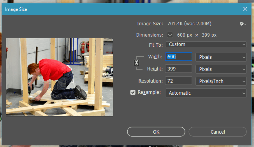
It’s important to note that if your image is already at a 72 pixel/inch (ppi) resolution, all that needs to be done is adjusting the dimensions. But if you’re optimizing an image from 300 pixels/inch (ppi), resampling gets added to the equation:

If you resample an image with a 300 ppi resolution down to 72 ppi, your dimensions will be significantly reduced, which is fine for images that don’t need to be large:

When you deselect Resample before reducing the resolution, dimensions are increased:


Rechecking Resample after reducing the resolution will allow you to adjust pixel dimensions accordingly:


There will be cases where the HTML element will dictate the specific dimensions of an image, like in the homepage RS Slider:


When an image’s dimensions are dictated by its element, it can be either left at its original size or cropped and framed to better fit its container. The following examples show images as they are in the WordPress Media library and how they appear coded into their respective elements on the page:


For fluid elements that use variable image sizes like those found in the Future and Current Students pages, the width is dictated by the HTML element, and the height follows the original image specification. The dimensions for these don’t need to be as strict, but it’s best to keep them within a reasonable size with framing in mind (“intrinsic” means the original dimensions of the image, and the first dimensions are the size of the element the image is in.):


In summation, unless an image needs to be a specific shape on the page, the aspect ratio doesn’t need to be too rigid. The Bootstrap class “img-fluid” is a good tool to get images to easily sit within their containers, and Photoshop is a versatile program for optimization. Be sure your images are 72 pixels/inch (ppi) resolution, using resampling techniques for more control over dimensions. You can crop or frame images whose dimensions are dictated by HTML elements, or let the dimensions be fluid based on dynamic layouts. Overall, images are fairly easy to work with and require very little optimization beyond resizing and resolution adjustment. For more information about web optimization, visit https://helpx.adobe.com/photoshop-elements/using/optimizing-images-jpeg-format.html.

